In terms of my master bedroom, I was pretty sure I wanted to mimic the board-and-batten that's been all over blogland to make my furniture really pop, I desperately wanted to replace my bedside tables (economically) and I also had a fabric for curtains in mind ... but that was it. Enter the magician known as Emily A. Clark.
By late last year, I'd been reading Emily's blog for a while, and I knew she was talented AND offered online design consultations. So last Fall, I ponied up the funds for one of Emily's mood boards, and BOY was I pleased with the results!
She challenged my devotion to warm colors with a cooler palette, which excited me. She incorporated things I already knew I loved into the design, while bringing a whole new set of ideas to the table that I'd never considered.
Not long after I received the mood board from Emily, I ran across Sarah's beautiful bedroom at The Yellow Cape Cod, and I was sure we were going in the right direction.
I was struck by how similar our rooms were in terms of layout and even furniture ... we had similar if not identical bedroom suites. Her room just looked a WHOLE LOT better than mine:
Seeing it was the kick in the pants I needed to get going, but it was a long process to purchase all -- well, MOST -- of the elements for the room. So far, I haven't purchased the mirror or had a third accent pillow made, and I haven't decided whether or not I will. But I think everything else is complete. So here we are, almost a year later, and I finally have something to share!
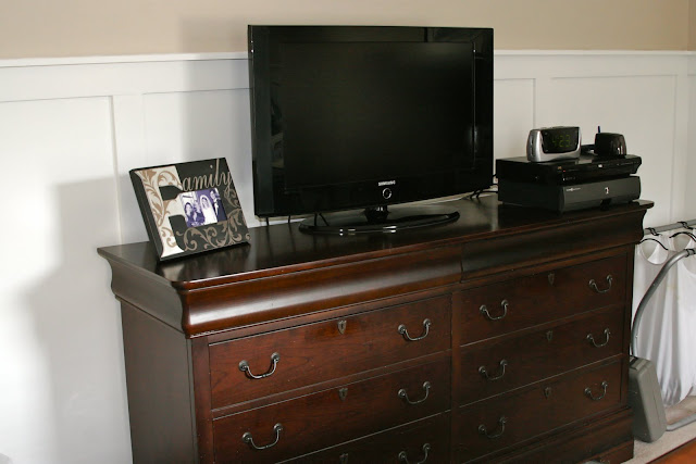
A disclaimer or two before I get into the Befores & Afters ... I'm QUITE sure that Emily would want me to tell you that she had nothing to do with the styling of the room. And by that I mean, the room hasn't been styled yet AT ALL. Unless you count the TiVo remote, labyrinth of electrical cords, alarm clock from the early '90s and stack of electronic equipment on the dresser as "styled."
I just know that with Amelia's arrival now imminent, if I didn't go ahead and take pictures now (and post them), it might be 2012 before it happens. And we can't have that, now can we? Because I still have to do this same process with the nursery and Nathaniel's room ... which at this point might take us into 2012.
Without further ado ...
BEFORE
AFTER
I know; the light's prettier in the Before. I don't have a professional waiting around to take the pictures, so I had to make do with myself. Sorry! (And a special "Sorry!" to Emily!)
BEFORE
AFTER
BEFORE
AFTER
BEFORE
AFTER
And now, just a closer look at some of the details of the room. Grayson's nightstand, which went from a standard bedside table to a vanity/desk from Ikea. This is a piece that we can easily repurpose elsewhere in the house if/when we ever decide to redecorate in here.
On my side of the bed, again, we did away with the traditional matching bedside table and went with a neat little number from Ikea. The finish matches the one on Grayson's side of the bed, but it's not as wide and is more of a table (with storage!) than a desk. I LOVE IT TO PIECES. Bonus: when you don't use your flash to take a picture of it, you can't see that the door doesn't exactly match up to the frame. (This is a by-product of me assembling both of these pieces all by myself. I love it anyway.)
And how much do you love all the cords under that table? SO MUCH? ME TOO. And that is after I unplugged two of the cords and moved my external hard drive out of the frame. What's left is just what's running on my power strip. So sorry to be sharing my reality with you all when this has turned into such a pretty room.
Here are a couple of close-ups for detail:
Next up, the lamps. You'll notice that on the mood board, Emily actually found white lamps at Target that she recommended. After multiple trips to multiple Target locations, I was never able to find two identical lamps. Nor could I find a similar pair at TJ Maxx, Home Goods or Tuesday Morning. And y'all. I am NOT an intrepid shopper. I have NO PATIENCE for shopping and really only shop online, so I had reached my limit.
When I went back to Home Goods for the third time to check and see if they had a second white lamp to go with the one I'd found earlier, I found TWO of these turquoise ones instead. And I didn't have my fabric with me, but I was 98 percent sure that these would match, or at least coordinate. So I grabbed them. And I love them.
And do you know what? Not three weeks later I was watching David Bromstad (one of my favorite designers) on Color Splash, and he used these very lamps in a project. I COULD HAVE DIED. I feel like I did alright.
I'm really happy with the white bedding I got on clearance at Pottery Barn, as well as with the chevron pillow covers that Emily found for me on etsy.
The bedding might pop a little more if I hadn't used the Euro shams, because with our Tempurpedic mattress, the Euro shams sit way above the top of the headboard. But those are things you just can't know until you have them in the room. And you know how I said I hate shopping? Well, I hate RETURNING even more. Not happening.
The Dwell Studio fabric that I'd loved (and I was THRILLED that Emily sort of built the design around) still makes me happy every time I walk in my room. I asked an acquaintance to make the curtains for me with blackout lining, and she did a great job.
When she delivered them, she felt so bad about me getting up on a ladder to hang them that she stayed and did it for me. With anchors. LOVE HER.
While I really wanted to go with a mirror over the headboard, for financial reasons I decided to just pull out the giclee print I had in the chunky black frame and replace it with a black-and-white canvas print I had made for 50 percent off (a Groupon or some such thing).
Visually I think it has the same feel, but it doesn't provide that extra percentage of reflected light that I could have gotten with a mirror. Maybe one day!
Last but certainly not least, I love the crisp, white board-and-batten treatment that one of our Cub Scout granddads installed for me around the circumference of the room. This was an element I was dying to try in our house, and I just love it.
It adds a level of architectural detail that simply isn't intrinsic to our mid-'80s home, and I think it "makes" the room.
Hope you've enjoyed the tour ... Emily has done three mood boards for me (master, kitchen and den), and I've loved them ALL. Her website says she's not accepting new orders at this time, because she's so busy taking care of her existing clients.
But another designer whose blog I read, Rene at Cottage & Vine, has completed two more mood boards for me (the nursery and Nathaniel's room), and I would love to refer you to her ($75 for an e-design like mine). I loved her designs, as well, and hope to be able to share the finished products with you soon!
Linking up to the DIY Showoff!


18 comments:
Love, love, love the room! It's so pretty! I tend to lean toward warmer colors, but I've always wanted to try a cooler bedspread like you did. When you paired it with the gorgeous curtains it just makes the room pop. Great job!
That looks fantastic!
beautiful! I love the drapes - that fabric is gorgeous and I am jealous of your HomeGoods lamps. I think I have bad HomeGood luck, I never seem to find the good stuff!
The room looks wonderful! I love Home Goods, especially their lamps. I bought 2 for the sunroom last year, more because I loved them for themselves. One stayed in the sunroom and the other didn't, but I couldn't part with it, so it is in the dining room until it finds a better spot.
Beckie
Your bedroom is beautiful Katherine! You must exhausted with everything you have going on. Thanks for the shout out :)
Katherine -- I LOVE it!! I am ready to redo our sunroom and was just trying to figure out where to begin. I am definitely going to look into the e-design boards - your room looks fabulous!!! I can't wait to see the nursery and Nathaniel's new room!!
I love the curtains! The rest of it is beautiful as well (especially the board and batten walls) but I have had a weird obsession with bird fabric lately, so the curtains just make me happy!
Love, love, love! I want to redo our master suite so badly. It was high on the list of "this paint color MUST GO" before we even signed the contract on this house. And yet, 7 years later....
Nothing like a good deadline to get you moving!
I LOVE it! (And, would you quit apologizing already?! You did a great job.)
I'm happy that you're happy with your room and that it's "finished" before Amelia's big arrival.
And, I also second that Rene is awesome :)
I love the board and batten treatment!!!! Absolutely adore it! One day I will have a house and I will have to curb my enthusiasm. It looks very inviting. :)
I'm smitten! The walls are divine and I really love the pop of color in the curtains and lamps... Bravo!
What beautiful changes... Love the cooler color palette and I'm drooling over those curtains. Great updates with the woodwork, too. It looks like a lighter and brighter space to me.
Wow, what a beautiful transformation. Emily is very talented, I admire her work. And, You did a fabulous job! Thank you for sharing my bedroom and for your sweet comments. Enjoy, Sarah
http://theyellowcapecod.com
Everyone deals with electrical cords that have to be there. There are several things on the market now that "contain" all those cords so you don't have a "family" of them :-) But you can also do the old, cheap trick of running them through a cardboard tube (like from paper towel or toilet tissue) then concealing the tube
somewhere...like behind the end table or under/behind the bed. And by the way, the room is divine!
Love the curtains. What was the name of the fabric and what site did you get them from?
Ginna, the fabric is by Dwell Studio and is named Vintage Blossom. I used the "jade" colorway, but they also have a yellow colorway named "citrine," and it's gorgeous. http://www.fabric.com/ProductDetail.aspx?ProductID=429ea5a2-de0b-4bb6-865e-4018d99a1ec6
Katherine....Emily did a fantastic job on your bedroom...I love both Emily and Rene. They are both special and talented bloggers.
Love the room, you did a great job making Emily's design come alive. I love, love, love the curtains they are just perfect. Your room is perfect for relaxing!
Post a Comment