The painters are actually there this week getting some paint on the walls, which is SUPER EXCITING! I don't have pictures of that yet. Maybe next week.
But here's what's been happening since we last met.
Most of our light fixtures have been installed, including the lanterns in the dining room. I love them! The trim in here has six (count 'em, SIX!) coats of paint on it now, so it's solid white and shiny as all get out. The walls above it will be Palladian Blue by the end of this week, later to be wallpapered. Unless I love the blue so much I can't part with it and I just go with a graphic rug instead. I can see that happening. I totally reserve the right to be a girl and do that.
The newel post and balusters are up in the kids' loft.
The balusters will be painted white, and the post and handrail will be dark grey. (Much better for hiding handprints, yes?)
Same in the basement. My contractor and I are having an argument over whether or not the left newel post is square. I say it's not. He says it is.
For the record, IT IS NOT. This is a hill I will die on. He's already messed with it once, but he's gonna be messing with it again.
The new shelves are in the new pantry location ... this used to be an empty closet with no functionality. I relocated our pantry here (inside the laundry room, adjacent to the kitchen) so that we could turn the old pantry into a mudroom. This will all be painted trim white.
The floating shelves are in the master bathroom hallway ... this used to be two ugly old builder-grade cabinets. I sanded them down, painted and poly'd them, and now they're in the garage waiting to be hung up to use as storage out there.
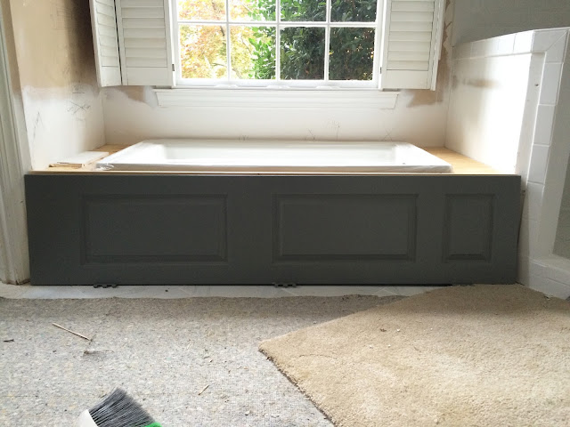
And we have a tub! I really wanted a free-standing tub -- not a clawfoot tub, just a basic soaking tub. But the HARDWARE for those things is RIDONKULOUS. I mean, so expensive. I just couldn't justify it. So, a drop-in tub it is.
My contractor just made the tub deck as small as he could so that it doesn't have too much of the look of those '80s "garden tubs" ... that was my main concern. And he designed the front in Shaker-style, like my kitchen cabinets.
I'd been planning to paint the front trim-white (the top will be the floor tile), but I propped one of the newly grey doors up against it, and now I've decided to go grey. I think it will look great against the Carrara tile on the top and on the floor.
Also grey? The mantel in the den. It's only been primed at this point, which is why it has a blue tint to it. But I love the way it looks against the tile! Things are FINALLY starting to come together.
I don't have full before-and-after pictures of the backyard yet, but it's fully landscaped as of last weekend. Here's a little peek:
BEFORE
AFTER
BEFORE
AFTER
We're scheduled to move July 17-19, which for me means missing a weekend scrapbooking crop I had planned with a group I've never been away with before. OPPORTUNITY COSTS, INTERNET.
I might have to comfort myself with some s'mores over that firepit.


No comments:
Post a Comment